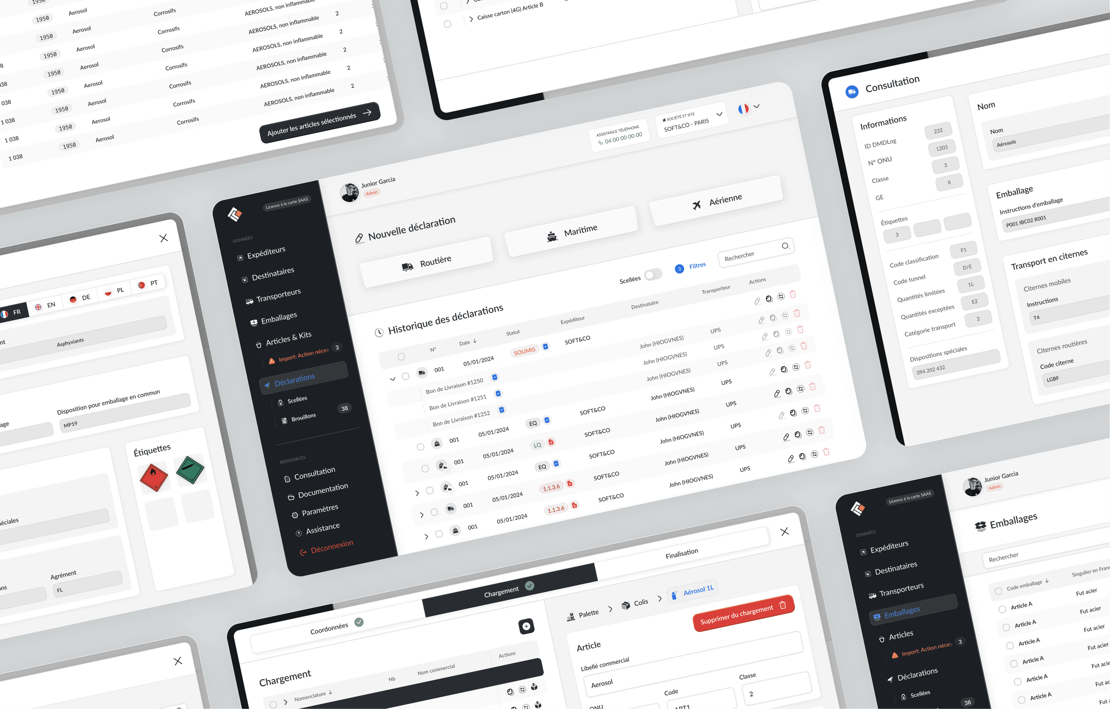
How I simplified a technical SaaS product and reduced friction
DMDLog is a tool for the transportation of hazardous material. They had an old heavy client and wanted to switch to a SaaS model to attract new customers
My roles
UI
UX
Prototyping
Key outcomes
Increased traffic
Better customer satisfaction
Key issues
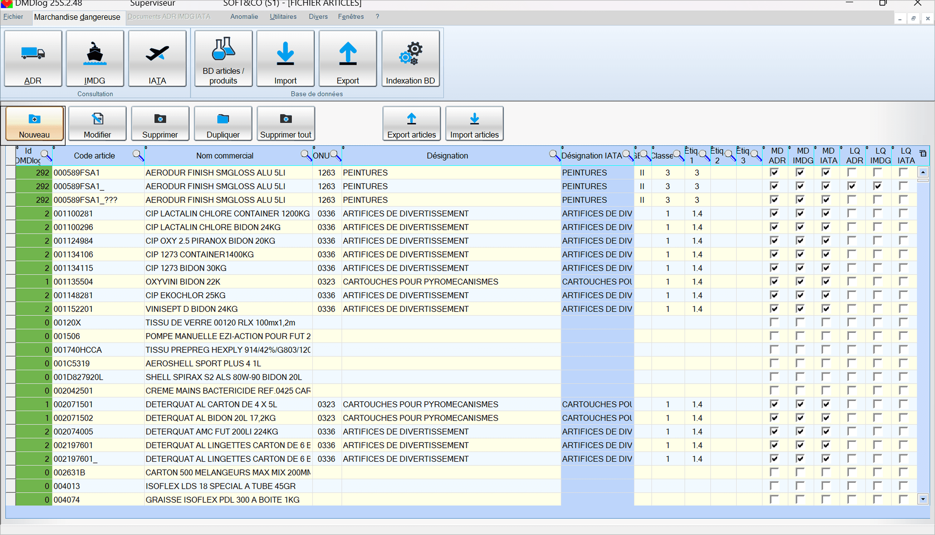
Outdated interface
Complex workflows with separate windows
High friction in daily operations
A revamp was never attempted since it required an extensive thinking process and understanding of the industry's challenges
Getting the redesign wrong could cause regulatory issues and potentially lawsuits leading to bankruptcy
The challenge
The challenge wasn’t visual design. It was reducing cognitive load while keeping every feature accessible.
Users already acclimated to how the platform worked
Complex and regulated workflows
Dozens of widows floating around
Database based (tables)
Dense tables
Complex forms


The start
Flew to France to sit down with the team to understand the industry and their challenges
Made sure I had a good grasp of the industry and the product before flying back home
Laid out all the databases and how they interact with each other
Started wireframing the structure with the team, keeping the important types of items always in sight thanks to the navigation bar on the left hand side

The main flow : Challenge #1
Another challenge was creating an order, it is the main flow and is thus critical. Operators typically perform the same three workflows dozens of times per day. Rather than optimizing for discoverability, I optimized for speed of repetition, bringing high-frequency actions within a single click.
The old way - A mess of windows
In the original version, creating an order meant simultaneously opening potentially 10 windows at once. A window for the main flow then for expeditors, recipients, carriers, packages and more.
The new flow
The new flow is much clearer, cleaner, with a window management that ensures the user doesn't get lost or sidetracks. Keeps the order the main focus and touchpoint.
From this flow, the user can access all relevant databases where it might be needed, sender, recipient, packaging, items, carrier etc… All accessible without steering away from the main flow.
How multiple windows are being handled
Of course one of the challenges being having windows scattered everywhere, I explicitly told the developers to keep it simple with a management of windows like follows, with a stack à la Apple that keeps the previous windows visible while keeping the layout neat :
Other challenges I met along the way : Challenge 2
Certain aspects were particularly complex to translate into an easy to use solution. One of this example is the action bar :
The old action bar
When selecting a product in the table, we had direct access to a lot of different actions, but it lacked flexibility and a lot of these actions were making the interface too busy. I realised they were not the most important elements, yet they were very prominent.

But how can I change this when users already formed habits around it ? I gave them options :
OPTION 1
Always-visible buttons
Smaller, leaves space for the actual content and navigation
Always accessible, even when scrolling horizontally
Adaptive : we only show the relevant actions, and grey them out if deactivated

OPTION 2
Right click actions
For those used to right clicking on windows, I wanted to make sure their workflow would not be disrupted. It seems small, but drastically improved the experience of this cohort.
WHAT ABOUT BULK ACTIONS ?
The smart action bar
Another vital aspect that's easy to overlooked is that users treat orders with hundreds of products, they need a way to apply actions to a bulk of items.
So I created a floating smart action bar :
Becomes visible when the user drags an item
Fully drag and drop for ease of use
Action buttons adapt to the item type
This way all the workflows are covered

While drag and dropping :

Also left indications to the developers on how to handle selecting and dragging several items at once :

Making info more visible : Consulting product info
Another important aspect of the job is to be able to check the characteristics of a product at a glance, which the original version was doing very poorly :
Old version
New version
Now everything is up to date, all the info is still there and appear dynamically depending on what needs to be displayed

With more options when creating the product

With this new version, everything is much easier to read and to find, yet no feature has been lost.
Result
We redesigned around daily workflows rather than individual features
Instead of exposing every option, we progressively revealed complexity
Modernized UI components
Improved clarity of core workflows
Completed the project in 5 weeks instead of 3 months planned
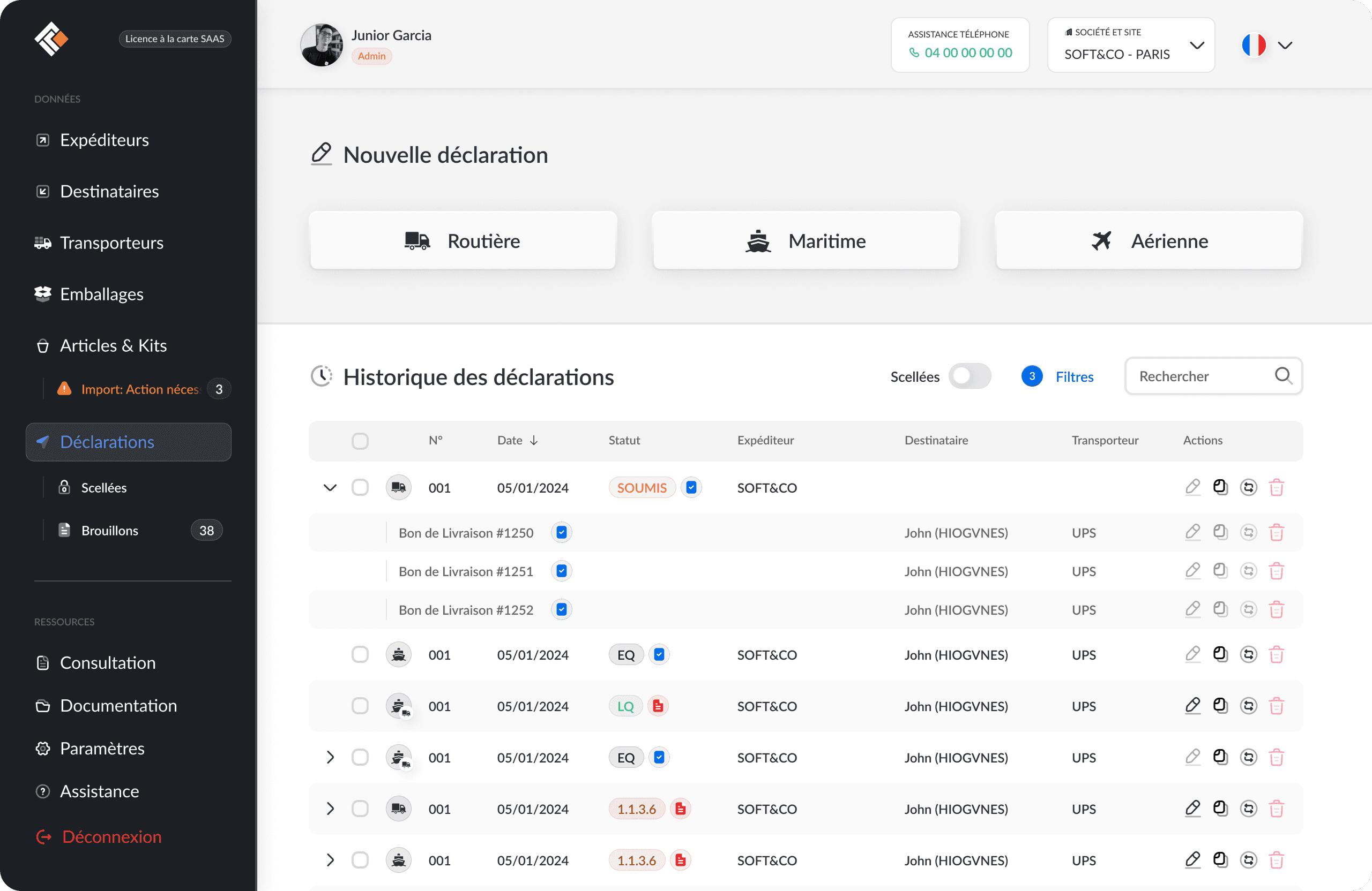
Of course the project being so complex, for the sake of the reader, I was only able to share some of the decisions I've made, barely scratching the surface
Impact
Increased traffic
Higher revenue from better usability
Teams reported the product became “much easier and faster to use”
What I learned
Enterprise/regulatory users value speed and safety over aesthetics
Consistency matters more than novelty
Small workflow optimizations compound over hours of daily usage
Learned, along with other projects, to turn highly complex workflows into a simple one
Client review
Stéphane
DMDLog